
Help Center / Dashboard
Dashboard
The Dashboard is your home page: a glance strip on top, then a grid of tiles you can arrange, resize, show, and hide. Every number follows the workspace selected in the top-bar switcher.
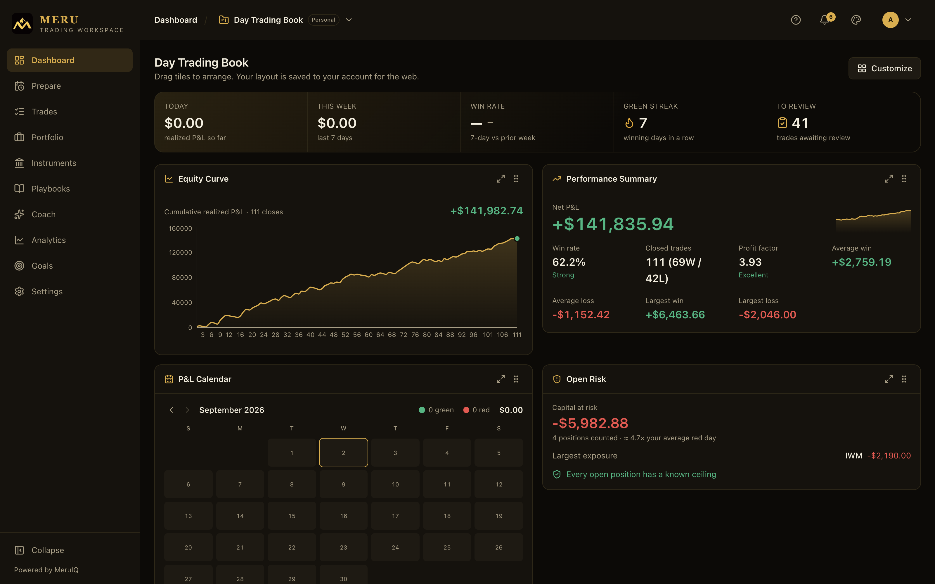
The glance strip
The banner across the top answers "how am I doing?" in five numbers. It shows zeros before your first trade. All amounts use your primary currency, whichever one has the most closed trades in this workspace.
- Today: realized P&L so far for the current day. Open positions do not count until they close.
- This week: realized P&L over the last 7 days.
- Win rate: your 7-day win rate, with an arrow comparing it to the prior week. Up means improving, down means slipping, a dash means roughly unchanged.
- Green streak: consecutive most-recent trading days that closed profitable. The flame lights while a streak is active; a dash means no active streak.
- To review: closed trades you haven't reviewed yet. Click the number to open Trades pre-filtered to those trades. When it reads 0, you're all caught up.
The tiles
Below the strip sits the tile grid. Each tile is a card with its own subject. In the default order:
Performance Summary
Your headline card. A large Net P&L figure with an equity sparkline sits on top, followed by Win rate, Closed trades (with the win/loss split), Profit factor, Average win, Average loss, Largest win, and Largest loss. Win rate and profit factor carry a quality rating (Excellent, Strong, Developing or Marginal, Needs review) colored green, amber, or red so you can judge them at a glance. Statistics build as you close trades.
Equity Curve
Cumulative realized P&L, one point per closed trade in closing order, with the current total on the endpoint dot: green if you're above zero, red if below. Hover the chart to read the exact equity at any close. The curve needs at least two closed trades to draw.
P&L Calendar
A month heatmap of your daily results. Each traded day shows its net amount and is shaded green or red; deeper color means a larger day relative to the month's biggest. Hover any day for the exact figure. The header totals up the month's green days, red days, and net result. Use the arrows to step to earlier months and the Today chip to jump back; today's cell is outlined.
Open Risk
The one forward-looking tile: what your open positions can cost you. It shows Capital at risk, how many positions that figure covers, roughly how many of your average red days it equals, and your Largest exposure by symbol.
Each position contributes what it can actually lose. With a stop, that's the distance to it. Without one, it's whatever caps the loss anyway: a long position can fall to zero, a long option can only lose its premium, and a cash-secured put can only be assigned at its strike. Positions with no ceiling, such as short stock or a call you sold without owning the shares, are named separately and left out of the total, because folding them in as a number would read as safety. When every position has a known ceiling, the tile confirms it. When you're flat, it says so.
Recent Trades
Your six most recent trades: symbol, side, open date, and either the realized P&L or an Open badge. Click a row to open that trade's detail page.
Discipline & Consistency
Your process, not your P&L. A journaling streak counter leads, followed by three meters: Journaled (30 days) for how many of the last 30 days you journaled, Trades reviewed for the share of closed trades with a completed review, and Plan adherence for how often you followed your plan.
Playbooks
Your top five playbooks ranked by net P&L, each with its trade count, total, and a row of dots for the last results (oldest first, green for wins, red for losses). Click a playbook to open its detail page. Results appear once you link trades to playbooks.
MeruIQ Nudge
One coaching prompt at a time, drawn from your own record with warnings surfaced first. When there are several, the tile rotates through them every few seconds; click a dot at the bottom to jump to a specific nudge. Requires the Ascent plan.
MeruIQ Insights
Up to four pattern findings from your trading record, each with a severity dot: green for positive, amber for a warning. Insights appear as your record builds. Requires the Ascent plan.
Goals
This month's goal at a glance: actual P&L against your target on a progress bar, plus trades closed against the number you planned. Set the goal itself on the Goals page. Requires the Ascent plan.
Where you trade in more than one currency, the Equity Curve and Open Risk tiles report your dominant currency and add a count such as 2 in other currencies not shown; currencies are never added together.
Books Leaderboard
Available only in organization and desk rollup views for team leads: every book in scope ranked by net P&L, with owner, trade count, and win/loss record. Click a row to drill into that book's read-only oversight view. See Teams & Organizations. In oversight views the personal tiles (Discipline, Playbooks, MeruIQ, Goals) are not offered; team members' journals and coaching stay private.
The Customize menu
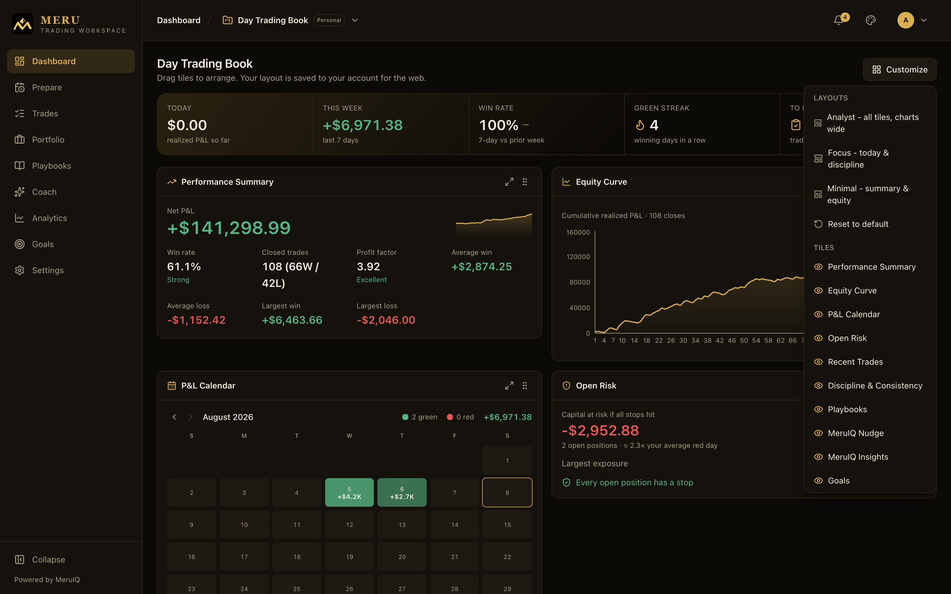
Click Customize at the top right of the dashboard to shape the grid.
- Under LAYOUTS, pick a one-click preset. Analyst - all tiles, charts wide shows everything, Focus - today & discipline narrows to the summary, discipline, recent trades, and your nudge, and Minimal - summary & equity keeps just the two essentials.
- Reset to default clears your arrangement and returns the stock layout.
- Under TILES, click any tile name to hide or show it. A highlighted eye means visible, a crossed eye means hidden. Hiding a tile never loses data; show it again any time.
Arrange and resize tiles
- To move a tile, drag it by the grip handle at the top right of its card and drop it where you want it. The other tiles flow around it.
- To resize a tile on wide screens, click the expand button next to the grip: it toggles the tile between Half row and Full row width. Charts such as the Equity Curve and the P&L Calendar start full width; smaller tiles start at half.
Every change saves automatically, per workspace, so each book keeps its own arrangement and it follows you to any browser you sign in from. Oversight scopes remember their own layout too.